
I hit a curious question for myself one day while driving to work. It seemed that no matter what time I left home, I got to work at nearly the same time. The idea being that traffic was such that it somehow normalized my arrival time. This puzzled me for a bit before I decided that the best way to deal with this quandary, was to test it. Easily done since I have a little GPS unit.
Armed with my Garmin, I logged five weeks of driving to work. This gave me a pile of data, so now what. I played with a few tools, Google Earth and the like, but none of these gave the information I wanted. Those that came close, wouldn’t present multiple data points in any way readable. Yeah for me; I get to write a tool.
I chose TCL/TK this time. (tclkit to be precise.) Partly because I have been finding it to be one of the cleaner cross-platfrom languages. Partly because of Tclkit. And mostly because you can use it without installing it. Download the interpreter and go. If you need some extensions, make a lib directory, drop them in there and append the auto_path. That’s all; a significantly easier process that most other languages. (well, Lua goes nearly as well, but doesn’t seem to have a good gui kit yet.) All that and I like the BSD license.
Anyways, I knew that the most important bit on information I wanted gleaned from my data was the start and finish times. Anything else would just be neatness. First I had to get the data out, quite easy to do with tdom, so no worries there. Then what to do with the data? A bit of poking and I decided that using a tabular view would be best. (Which brought wonderings on how spreadsheets would handle XML data, but I didn’t feel like investigating that.) So a bunch more poking, and I found tablelist, which turned out be be an awesome find.
The basic start stop time was right in the time stamps, so that was easy. So I had to add a bit more info. I wanted distance and speed. Speed would fall into place once I had distance, so easy there. Now getting the distance, in miles, from latitude and longitude data seemed like it was going to be a lot more difficult. Turns out to be quite simple, you use the Haversine Formula. So now I had the information I wanted out of my data.
This was too easy. So I added a very basic plot that was colored by speed, just because I could. I thought about tying a image of the roads into the plot, but I never really got around to it. As far as my original question, well, I’m not sure. The current data sample is inconclusive. I could find no collations between when I left, how long it took me, and when I arrived.
But I had fun playing with the data and building this tool, so it was a net gain.
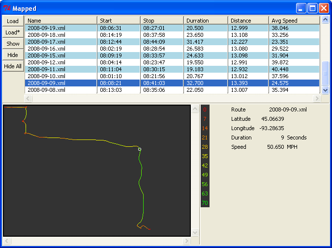
(I also was too lazy to compile tdom for MacOSX, and just ran XP inside of VirtualBox. Just in case you’re wonding about the screenshot here.)
Silly me forgot to put this up first time around, but here is the code.